
Data visualize tools are game-changers for businesses, turning complex data into clear insights that drive smart decisions. The right tool helps you uncover hidden trends, make quicker choices, and stay ahead of competitors. By converting raw data into visual formats, these tools enable companies to identify trends, enhance decision-making, and foster growth.
However, with so many data visualize options available, choosing the best one can be overwhelming. Selecting the right tool is crucial for streamlining operations, boosting productivity, and making informed decisions quickly.
Ready to discover the perfect data visualize tool for your business? Let’s explore the key factors to consider!
1. Data Visualize: Why Smart Insights Lead to Smart Growth!
By harnessing data visualization tools, organizations can make informed decisions faster. 61% of executives believe that visual analytics significantly enhances their decision-making processes. As the digital landscape evolves, these tools are set for dramatic advancements that will redefine how we interpret and interact with data.
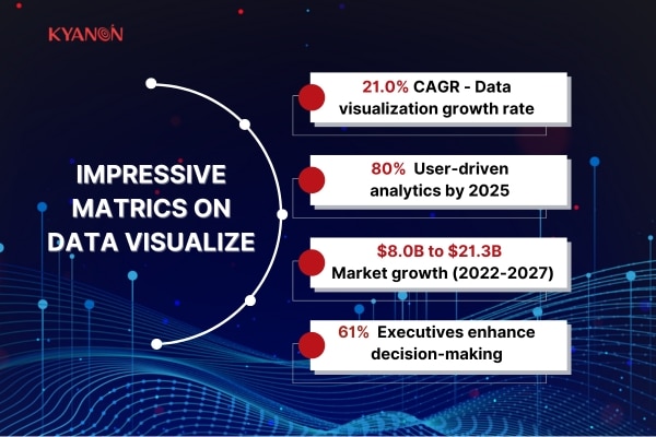
According to a recent report by MarketsandMarkets, the global data visualization market is on track to soar from $8.0 billion in 2022 to an impressive $21.3 billion by 2027. This growth, representing a compound annual growth rate (CAGR) of 21.0%, reflects the increasing demand for business intelligence and real-time data analysis. Companies like Tableau are leading the charge, with a remarkable 40% year-over-year increase in their user base.
Moreover, a study from Gartner predicts that by 2025, 80% of analytics projects will be driven by business users rather than data professionals. This trend shows a move toward simpler, more user-friendly visualization tools. By adopting these new tools, businesses can stay competitive and make smarter decisions that fuel their growth.
2. Choosing Smart: How to Select Insights That Drive Growth!
When choosing a data visualization tool, businesses should consider several important factors to find the perfect fit for their unique needs. Let’s explore these essential elements and discover how they can elevate their data game and drive smarter decisions!
2.1. Data Complexity and Scalability
As businesses grow, data visualization tools must efficiently handle large and complex datasets. Companies like Amazon and Netflix deal with vast amounts of data daily.
Netflix has been a data-focused company since its inception. It employs a range of skills, including Data Engineering and Consumer Research, to analyze data quickly. Its advanced analytics help it understand viewer preferences, enabling data-driven decisions about content and marketing strategies.
Choosing scalable tools is essential to manage increased data volume and complexity without sacrificing performance, supporting smarter decisions and enhanced member experiences.
2.2. Ease of Use and User Interface
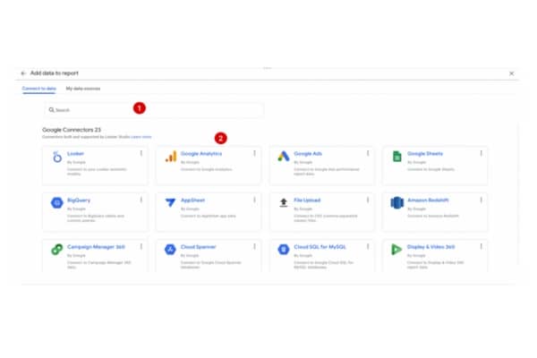
User-friendly data visualization tools are key to driving adoption and maximizing effectiveness in your business. For example, Locker Studio (Google Data Studio) offers a simple interface that empowers users at all skill levels to create impressive visual reports easily. Its drag-and-drop functionality makes data visualization accessible, even for teams lacking technical expertise.
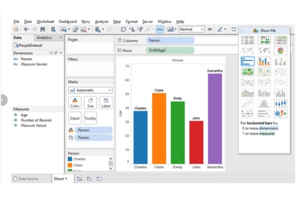
In contrast, Tableau provides a visually appealing interface that encourages intuitive data exploration.
Prioritizing user experience boosts engagement and motivates teams to leverage data insights effectively. Choosing the right tool can transform how your organization interacts with data.
2.3. Customization and Flexibility
Every business has unique needs, so it’s crucial to choose customizable tools that can adapt to your specific requirements. Power BI from Microsoft allows users to create personalized dashboards tailored to their KPIs. For example, Coca-Cola uses Power BI to visualize its sales and marketing data, enabling quick adjustments to its strategies based on real-time insights. This flexibility allows businesses to modify visualizations and reports to align with their objectives and workflows.
2.4. Integration Capabilities
Seamless integration with existing systems is vital for smooth operations. Leading brands like Salesforce and HubSpot provide excellent integration options, allowing businesses to connect their data visualization tools with CRM and marketing platforms easily. This integration ensures a cohesive workflow and allows for real-time data updates across all platforms.
For instance, when Shopify integrated its platform with various data visualization tools, merchants could visualize their sales and customer data in real time, enabling them to make informed decisions swiftly. Look for tools that can effortlessly integrate with your current systems to streamline processes and enhance productivity.
2.5. Security and Compliance
Data security and regulatory compliance should always be a priority when choosing a tool. Companies like IBM and Oracle offer robust security features, ensuring that sensitive data remains protected. For example, IBM Watson provides advanced security measures to safeguard data while complying with regulations like GDPR.
As data privacy becomes increasingly important, selecting a visualization tool that prioritizes security and compliance will not only protect your business but also build trust with your clients.
3. Finding the Right Fit for Your Needs
Understanding the different types of data visualization tools is crucial for businesses aiming to turn raw data into actionable insights. Here’s an overview of the main types of tools available, along with guidance on when to use each one based on your business needs.
3.1. Charts

Charts are one of the most common ways to visualize data. They simplify complex data sets and make it easier to understand trends, comparisons, and relationships. For instance:
- Bar Charts: These are ideal for comparing quantities across different categories. Companies like Coca-Cola use bar charts to analyze sales performance across different regions, helping them identify which markets are performing well and which need attention.
- Pie Charts: Best for showing parts of a whole, pie charts can help businesses visualize market share. Apple, for example, uses pie charts in reports to illustrate its share in the smartphone market, providing clear insights at a glance.
3.2. Graphs

Graphs are useful for displaying data points to each other over a certain period. They help identify trends and patterns over time.
- Line Graphs: These are excellent for showing changes over time. Netflix utilizes line graphs to track subscriber growth, giving them insight into how their marketing strategies impact user acquisition.
- Scatter Plots: These show the relationship between two variables. Businesses like Amazon can use scatter plots to analyze customer behavior, such as the relationship between product pricing and purchase frequency.
3.3. Dashboards

Dashboards combine various visualizations into a single interface, providing a comprehensive view of key performance indicators (KPIs). They allow businesses to monitor metrics at a glance.
For example, Salesforce offers customizable dashboards that help sales teams track their performance in real time, allowing for quick adjustments to strategies. A well-designed dashboard can provide insights into sales performance, customer engagement, and even employee productivity.
3.4. Heat Maps
Heat maps visualize data density and are especially effective for geographical data. They use color to represent different values, making it easy to identify hotspots.
Retailers like Walmart use heat maps to analyze customer shopping patterns within stores, helping them optimize product placements and enhance the shopping experience.
3.5. Infographics

Infographics combine images, charts, and minimal text to present information quickly and clearly. They are particularly useful for summarizing data in reports or presentations.
3.6. When to Use Each Type
Choosing the right data visualize tool depends on your business needs and the type of data you’re analyzing. Here’s how to effectively use different types of data visualize options:
- Charts are perfect for comparing discrete categories or showing proportions. They help you visualize relationships between different groups.
- Graphs excel at tracking changes over time or illustrating relationships between variables. Use them to reveal trends and patterns in your data.
- Dashboards provide an overview of performance metrics and key performance indicators (KPIs). They allow you to monitor business health at a glance.
- Heat Maps are ideal for geographic data analysis, helping you visualize data density across regions. This can be particularly useful for market analysis and resource allocation.
- Infographics are great for storytelling, allowing you to summarize complex data in an engaging way. They can effectively communicate key insights to your audience.
By understanding these various data visualize tools, businesses can choose the right options to clearly communicate their data insights. Embracing these tools can transform how organizations view and interpret their data, leading to smarter strategies and better outcomes. Data visualize is not just about creating charts; it’s about unlocking the potential of your data to drive informed decisions!
4. Path to Success: Step-by-Step to the Perfect Data Visualize Tool
Choosing the right data visualization tool is crucial for transforming your business data into actionable insights. With so many options available, it can be overwhelming to find the tool that best meets your specific needs. Follow these simple steps to ensure you make an informed choice that will elevate your business!
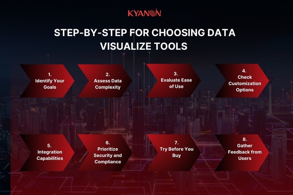
4.1. Identify Your Goals
Start by clarifying your objectives. Ask yourself what you want to achieve with data visualization. Are you looking to enhance reporting, improve data analysis, or share insights across your team? Defining your goals will help narrow down your options.
For example, if your aim is to create engaging presentations for stakeholders, a tool with robust charting capabilities like Tableau might be ideal.
4.2. Assess Data Complexity
Consider the complexity of your data. Do you handle large datasets, or is your data relatively simple? Some tools excel in processing vast amounts of information, while others may struggle.
Microsoft Power BI is great for businesses dealing with extensive data, as it can handle multiple data sources seamlessly, making it easier to create comprehensive visualizations.
4.3. Evaluate Ease of Use
User-friendliness is essential for smooth adoption. A tool that is difficult to navigate can hinder productivity. Look for intuitive interfaces that allow your team to create visualizations without extensive training.
Google Data Studio is known for its simple drag-and-drop interface, making it accessible for users of all skill levels.
4.4. Check Customization Options
Every business has unique needs, so flexibility is crucial. Ensure the tool you choose allows for customization. Whether it’s altering visual styles or adding specific metrics, a good tool should adapt to your requirements.
Qlik Sense offers extensive customization options, enabling businesses to create tailored dashboards that reflect their branding and metrics.
4.5. Integration Capabilities
Your data visualization tool should easily integrate with your existing systems. This ensures that you can pull in data from various sources without hassle.
For instance, if your team uses Salesforce for customer relationship management, look for a visualization tool that can connect directly to it, like Domo. This integration helps streamline workflows and enhances data accuracy.
4.6. Prioritize Security and Compliance
Data security cannot be overlooked. Ensure that the tool complies with industry regulations and has robust security measures in place.
Tools like Looker prioritizes data governance, allowing you to manage who has access to sensitive information, thus maintaining compliance with regulations such as GDPR.
4.7. Try Before You Buy
Most reputable tools offer free trials or demos. Take advantage of these opportunities to test the features and usability of each tool. This hands-on experience can provide invaluable insights into how well a tool meets your needs.
4.8. Gather Feedback from Users
Once you’ve narrowed down your options, gather feedback from team members who will use the tool regularly. Their insights can highlight aspects you may have overlooked and help you make a more informed decision.
Conclusion
Choosing the right data visualization tool is essential for turning data into valuable insights. Start by defining your goals and considering your data’s complexity. With the right data visualize tool, you can boost your business insights and make smarter decisions. Don’t just chart—start your business smart!
Ready to transform your business insights? Discover how data visualize tools can elevate your decision-making process and unlock hidden potential within your data. At Kyanon Digital, we specialize in helping businesses find tailored data visualization solutions that fit their unique needs. Our expertise in data visualization ensures you make informed choices that lead to smarter outcomes.
Don’t wait—reach out to Kyanon Digital today to learn how we can help you harness the power of data visualization to propel your business forward!


")


 Create project brief with AI