


A factory can become more efficient while customers wait longer for the right product. A dashboard is useful only when it changes an allocation decision, by making the choice visible, timely and reviewable.
By Rosy Giang Tran, Consulting Practice Lead, Kyanon Digital – Digital Consulting, Data, BI & AI
Key takeaways
- Arrange KPIs in a hierarchy (customer outcome, decision signals, operational drivers), not as a row of unrelated cards.
- Agree what OTIF means before you build the dashboard. The definition shapes the incentives.
- Design the drill path around the decision meeting, and log every action so the business can learn from it.
The monthly operations review opens with progress. Equipment effectiveness is up. Changeovers are down. Finished-goods stock is within target. Then the commercial team reports more distributor orders arriving late or incomplete, and Hanoi short of a product that looks plentiful nationally.
In Week 1 we traced that shortage to decision latency. In Week 2 we designed a data product that keeps product, location, status and observation time intact. This week is about what leaders and teams do with that trusted evidence.
A good KPI is not a complete explanation
Longer production runs may well have lifted equipment effectiveness. They may also have produced a mix that no longer matched demand in the North. Other explanations are possible too: a stale demand plan, an allocation rule that favoured modern trade, a late distributor file, a quality-release constraint, or a transport lead time. Most likely it was several at once. Putting equipment effectiveness next to service level on one screen is a signal to investigate. It is not a causal analysis.
The measures also live at different grains. Equipment performance belongs to a line and a shift. Inventory belongs to a product, batch, status, location and point in time. Customer service belongs to an accepted order and its promised date. BI has to connect them in a hierarchy that leaders can read top-down:
|
Level |
Illustrative measures | The question it answers |
|---|---|---|
| Customer outcome | On-time in-full (OTIF), stockout days, orders at risk |
Did the customer get the right product when promised? |
|
Decision signals |
Days of cover vs. replenishment lead time; released, uncommitted stock; orders due before the next receipt | Which commitments can still be protected, and by when? |
| Operational drivers and constraints | Plan adherence, equipment effectiveness, quality release, transit time, allocation rights, freight cost |
Which options are feasible, and what would they displace? |
Exhibit 1 – A KPI hierarchy, not a row of cards

One Hanoi OTIF exception traces down to two decision signals and three operational drivers. Each link is a hypothesis for the team to test, not a proven cause.

Even with trusted data, teams can disagree about what “service improved” means. Is “on time” measured against the date the distributor requested, or the date the manufacturer accepted? Can a promise date be moved after acceptance? Is an order “in full” when most lines arrive, or only when every line does? What happens to an order still undelivered at the reporting cutoff?
These choices shape behaviour. If overdue open orders drop out of the denominator, service looks better without a single extra delivery. If promise dates can be reset without keeping their history, a late delivery can look punctual. ISO 22400 and APQC’s OTIF measure help structure the conversation. Each business still has to approve its own rules. For our scenario, an illustrative semantic contract might read:
|
Contract field |
Proposed rule for distributor-order OTIF |
|---|---|
| Business question |
Of accepted distributor orders due this period, what share arrived complete by the original agreed date? |
|
Formula |
Eligible orders delivered in full by the original agreed date ÷ all eligible accepted orders due, including overdue orders still open at cutoff |
| Grain |
Order for the headline figure; line level kept for product diagnosis |
|
Promise-date policy |
Keep the original date and every revision as separate events; report against each explicitly |
| Evidence |
Confirmed delivery or proof of delivery, an agreed cutoff, and a visible “pending confirmation” state |
|
Owner |
Supply chain and commercial approve jointly; the data and BI team versions and tests the implementation |
The semantic layer then carries that definition into every report. The plant director and the sales director see the same customer outcome, each with their own drill path. If the definition changes, the version history explains the break in the trend. A dashboard redesign cannot quietly change the business result.
Design the drill path around the decision meeting
The first page should tell an executive where attention is needed, not make them infer an allocation action from dozens of charts. The same model supports a clear sequence of views:
- Outcome. Which service commitment is slipping or at risk? Show realised OTIF separately from orders projected to miss.
- Location and product. Which distributor, region, product and due week explain the exception, and how large is it?
- Evidence and confidence. How much released, uncommitted stock is there, and where? When was distributor stock last observed? What is missing or disputed?
- Options. Reallocate company stock, request a partner transfer, or change the next production mix? What would each affect?
- Action. Who approves, when is it executed, and when will we check that it worked?
Context must carry through the drill path. If a leader filters to the one-litre cleaner in Hanoi, every following view keeps that product, region and decision date. A national average should never silently replace the local problem, and an old distributor observation should stay visibly old from page to page.
Exhibit 2 – Four linked BI views
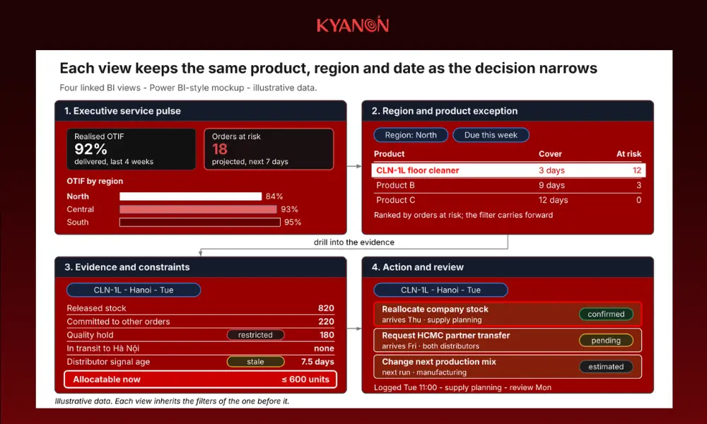
The executive pulse flags the North, the exception view isolates the one-litre cleaner, the evidence view shows what can actually move, and the action view records who decided what.
Make the trade-off visible before asking for approval
At Tuesday’s allocation checkpoint, the BI view turns the facts into a comparison of actions:
|
Option |
What the team must confirm | Trade-off to show | Decision owner |
|---|---|---|---|
| Reallocate released, company-owned stock | Uncommitted quantity, dispatch cutoff, transit time, other orders affected | Hanoi service protected vs. risk elsewhere and extra freight |
Supply planning, with commercial priority |
|
Request an HCMC-to-Hanoi partner transfer |
Ownership, consent, handling and transit time | Speed and cost vs. disruption to the partner | Commercial and both distributors |
| Change the next production mix | Capacity, materials, quality-release timing, the run it displaces | Future recovery vs. changeover cost and other commitments |
Manufacturing and supply planning |
This table is a decision aid, not an automated recommendation. One option may already be impossible because the truck has left. Another may fix the shortage only after the customer’s due date. Showing those constraints is useful in itself, because the meeting stops debating moves that cannot change the outcome.
Keep observed facts, estimates and proposals visually distinct. A quality hold is a recorded status. Tomorrow’s stock cover is an estimate. A partner transfer is a proposal until consent and transport are confirmed. Blending the three into a single number gives leaders false certainty.
Exhibit 3 – The allocation decision canvas
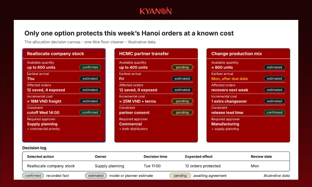
Each option shows what is confirmed, estimated or still awaiting agreement. The production change is visibly too late for this week’s orders, so the meeting does not spend time on it, and the chosen action goes straight into the log with an owner and a review date.
One model, a view per role, and a decision rhythm
Executives need a short list of material service risks and the actions under way. Regional sales needs distributor cover and commitments. Supply planning needs the available-to-promise logic. Quality needs to see which batches can be released, and when. Warehouse and transport need an approved instruction with a feasible dispatch time. Every view shares the same definitions. Role-based access limits sensitive detail without changing what a measure means.
A simple rhythm completes the design. A short daily exception review confirms new risks, resolves disputed data and assigns actions. A weekly review checks whether those decisions improved service, and at what cost. Both meetings ask the same question: what changed, what can we still influence, and who acts by when? The action log from those meetings becomes the most valuable input for next week’s topic, AI.
Client story: one version of the truth across more than 193 stores
A leading retail and trading group headquartered in Ho Chi Minh City, operating more than 193 stores nationwide, ran on manual reporting. Its data was fragmented and had no central repository, report approvals were slow and hard to track, and leadership had limited visibility into store performance.
We built a centralised data warehouse, a standardised report-submission and multi-tier approval workflow, and Power BI dashboards for leadership. Reporting and approval cycles became faster, errors fell, and standardised data cut reconciliation time.
A distributor network looks a lot like a store network: many locations, the same products, a need for one version of the truth, and a workflow that makes someone accountable for acting on it.
Measure BI by decisions, not by dashboards launched
Judge BI at three points. Visibility: did the team spot the product-region exception earlier? Decision: did it set out feasible choices and assign an owner before the window closed? Outcome: did service improve without shifting an unacceptable cost or shortage elsewhere? Counting launched dashboards answers none of these.
One product family and one region are enough to start. Agree the OTIF contract, build the executive exception view and the planner’s decision canvas on the Week 2 data product, and run them in the real allocation meeting. Extend the measures only after they survive operational use.
How we help. Our Self-Service BI Enablement and Data Strategy & Governance teams define semantic measures with your business owners, build role-based Power BI views and decision workflows, and set up the operating rhythm that makes the dashboards change behaviour. Explore our Data, Analytics & BI services.
Your next step: a KPI and dashboard review. Bring a recent service miss, your current KPI definitions and the dashboards used to discuss it. We trace the exception from customer outcome back to source evidence, draft the semantic contract, and redesign one decision view with your team. Book a review.
See the change, trust the evidence, choose within constraints, act in time, learn from the result.
Next week: “Industrial AI Scales One Decision Loop at a Time” – how to move from trusted BI and recorded actions to governed AI recommendations with measurable value.
The manufacturer, metrics, options and KPI contract are illustrative. Client stories are separate published engagements.









 Create project brief with AI